
Be yourself; Everyone else is already taken.
— Oscar Wilde.
This is the first post on my new blog. I’m just getting this new blog going, so stay tuned for more. Subscribe below to get notified when I post new updates.
This is a short video I made for my COM 220 class on how to survive the class and some of my tips!

For this project, we were asked to research a famous digital designer, and in all of my digging, I found Ruth Ansel’s work to be the most interesting to me. Ruth Ansel has definitely kept herself busy over the course of her life so far, working for some of the biggest names in the media. She graduated from Alfred University in 1957 and started working for Columbia Records. After that, she began to work in the Art Department of Harper’s Bazaar where she learned a new style and the importance of having a ‘critical eye’. She later became a co-art director for the magazine, to then move on to become the first female art director of the New York Times. Other credited companies she has under her belt include House & Garden, Vanity Fair and collaborated with people from Andy Warhol to Annie Leibovitz. She later opened her own design studio, where she still continues to produce amazing content with revolutionary ideas.
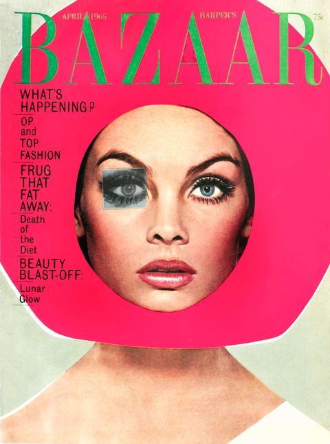
This is one of my favorite piece’s of Ansel’s work and notably one of her most famous. This was a cover for Harper’s Bazaar Magazine that starred Jean Shrimpton and was published in April of 1965.
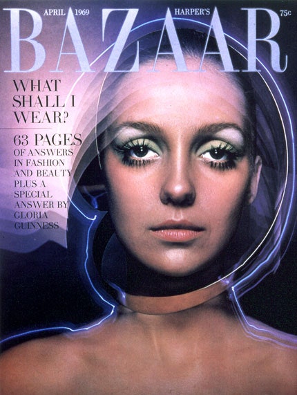
Another famous piece by Ansel was this magazine cover, also for Harper’s Bazaar. This was published in April of 1969 and all artistic direction and design was done by Ansel.
Ruth Ansel appeals to me because a lot of her work, specifically some of her magazine covers are very unique and feature bright colors which I think makes them so individual to her. I also like how different all of her pieces are, as it shows her wide range of talent and skill that she further developed over the years.
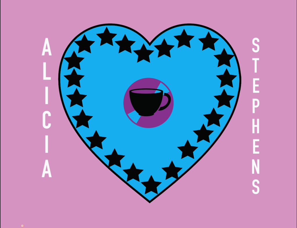
This logo describes me personally because I think the most important thing in life is love which is why I made it the focus point of my logo. The second thing I tried to emphasize is my love for stars. A lot of my clothes have stars on them which is something my friends make fun of me for, but I don’t really care! Finally, I put the record image and the coffee cup inside of the heart to show how much I love both music and coffee, especially together!
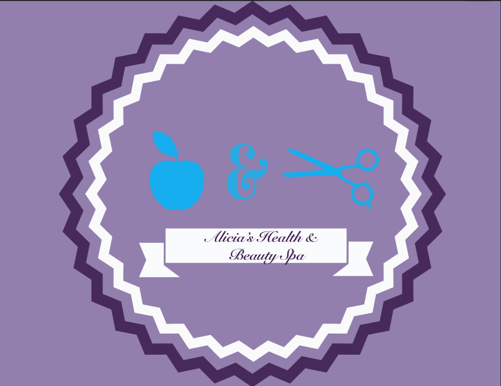
This was the logo I made for my fictitious business, I tried to make it look classier and more professional than that of my personal logo. I love makeup, working out and self care so if I could make my own business it would definitely be something like this!
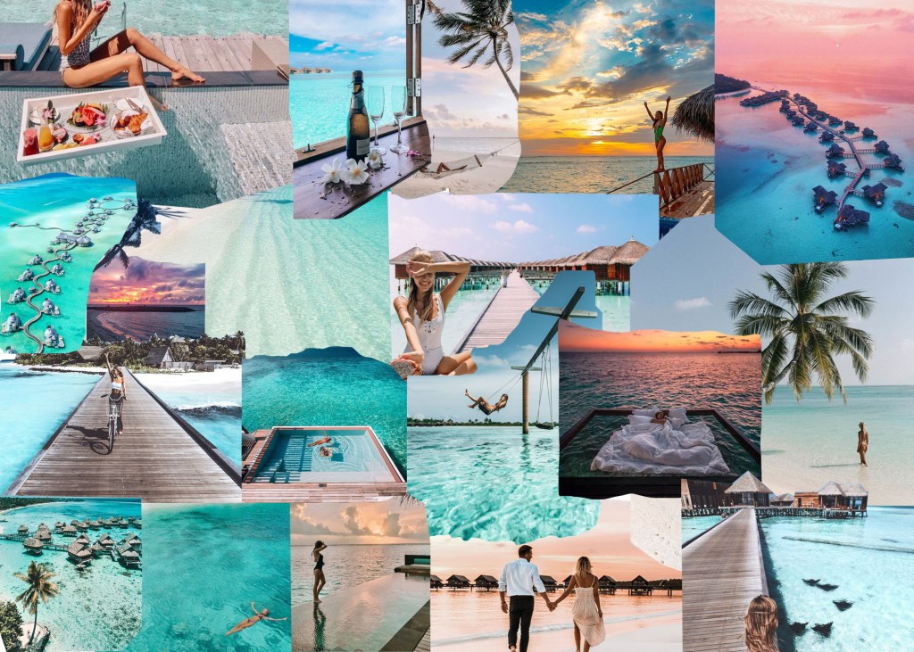




For this assignment, we were instructed to find 5 objects that had a value of meaning to us and photograph them using a digital camera but find a unique way to display the item, with the background also having a deeper meaning of the object. For my 5 objects, I wanted to choose things that were in my dorm room, because some of these are things I have collected while at school, and others have been brought from home. My room is a personal safe space for me and I enjoy being in it as I feel I am constantly surrounded by the things I love the most, which is why I chose my objects to be from there.
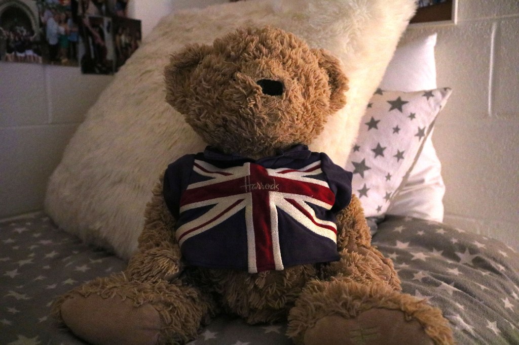
This is my teddy bear Benjamin Button. I got him the day we moved to the United States from England at Harrod’s in Heathrow airport. As silly as it seems, I still have to sleep with him every night as a comfort item and even my friends at school have grown to love and accept Benji as their own. I decided to shoot this image with him sitting pride of place on my bed, as this is how he usually sits after I make my bed every morning. I also liked how the lighting was a little darker because it was slightly comedic to me how mysterious it made him look, seeing as he is just a teddy bear.
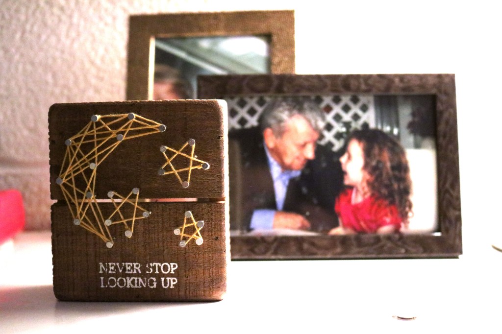
The next item that I always keep close to me is this sign that my big in my sorority gave me last year. I keep it next to my bed at school, and at home because it is one of the first things I see in the morning which is a nice way to stay motivated and positive. I decided to place these picture frames behind it but keep them out of focus because I was really close to my grandfather, who has now passed, so its a nice reminder to keep looking up because I know he is looking down on me.
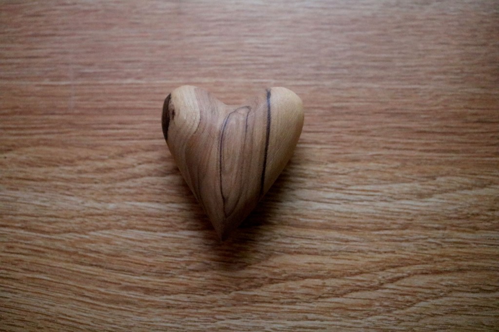
Another item that I keep very close to my heart (no pun intended) is this wooden heart that I was given after my grandfather passed away. He used to hold it at night as it fits into your hands perfectly because of the indentation in the top. Whenever I am sad and miss him, I like to hold it and think of him, but it makes me happy because it is as if I have a piece of him to myself. I decided to place it against the wooden background because I thought it was a cool contrast of having the horizontal wooden pattern against the vertical wooden pattern of the heart, to make it stand out a little better.
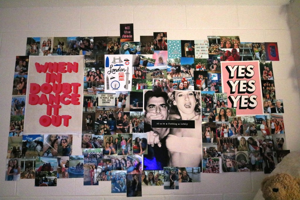
The next meaningful thing isn’t technically an item but it is a collection of memories and moments from my life that are important to me all in one place next to my bed. I didn’t take this photo to focus in on specific individual pictures or posters, it was to capture the overall sense of love I get from looking at this wall every day surrounded by people and things that I love. I edited this picture to have slightly cooler tones because I thought it made the letters in the signs stand out more which was the vibe I was trying to achieve.
My fifth, and final object is this blanket that I was given by my boyfriend. It was a Christmas present from this year but was one of the sweetest gifts I have ever gotten. The collection of pictures and words on the blanket makes it so special as it makes me feel close to him when we are separated. I remember how happy I was when I got it and every time I use it that feeling comes rushing back to me and makes me instantly in a better mood. I decided to take the picture of it laid out across my couch because this is where I like to keep it for on the go use. I usually have it around my head walking around my apartment but I thought the contrast of the white couch and the purple blanket in front of the wall of string lights really made it stand out.


For this picture, I adjusted the levels by using the eyedropper tool on levels and selecting her white pillow to adjust the levels to that. I also decided to crop the image to make sure her face was the most important thing in the photo which I think goes well with the fact that her face is illuminated by the laptop screen. By adjusting the overall brightness of the picture, it makes it brighter and more inviting to look at.
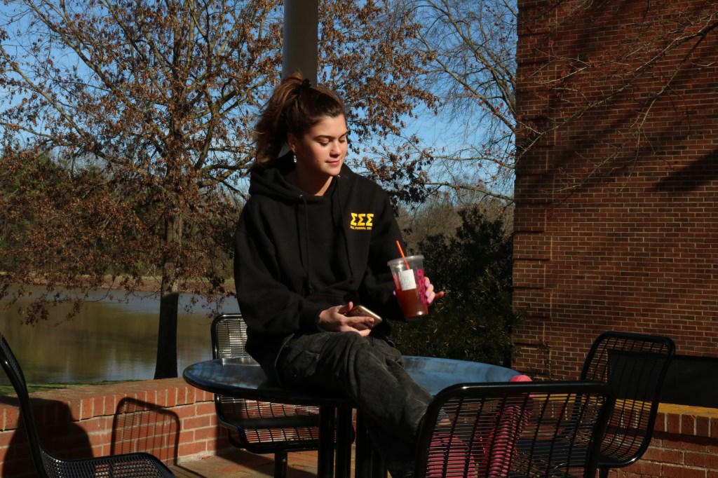
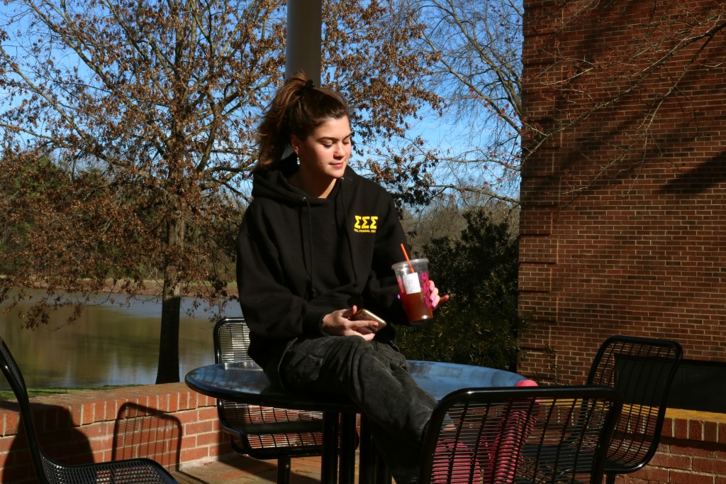
For this image, the background seemed a little dark, so I concentrated on trying to get the correct color for the scenery, without making too much of a difference to her face and body. The overall color scheme of what she is wearing is pretty dark and I didn’t want to take away from that so I adjusted the Red, Green and Blue tones on photoshop to where I was happy with the background and the subjects body.
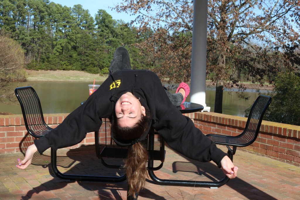
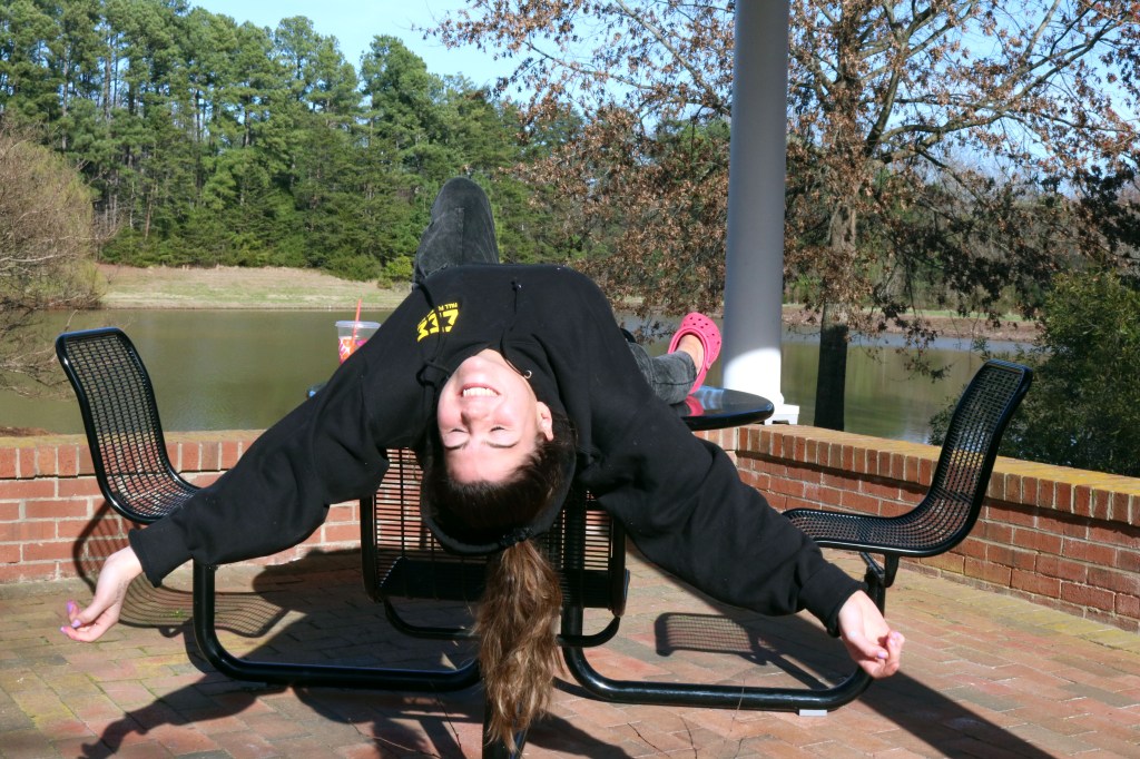
This image seemed a little washed out or over exposed at first so I fixed that by making the green and red tones heavier in photoshop. The second image is better because the background is a lot more vibrant and the green in the trees is a lot more prominent which is something I tried to focus on while I was editing.


Similarly with this photo, it seemed a little washed out and over exposed so I tried to fix that by adjusting the Red, Green and Blue levels, focusing on the green in the grass seeing as some of it is already washed out from the dryness. I overall wanted to make the image slightly brighter and I think I succeeded in doing this by making the Blue and the Green tones a lot more prominent than they originally were when I shot the photograph.
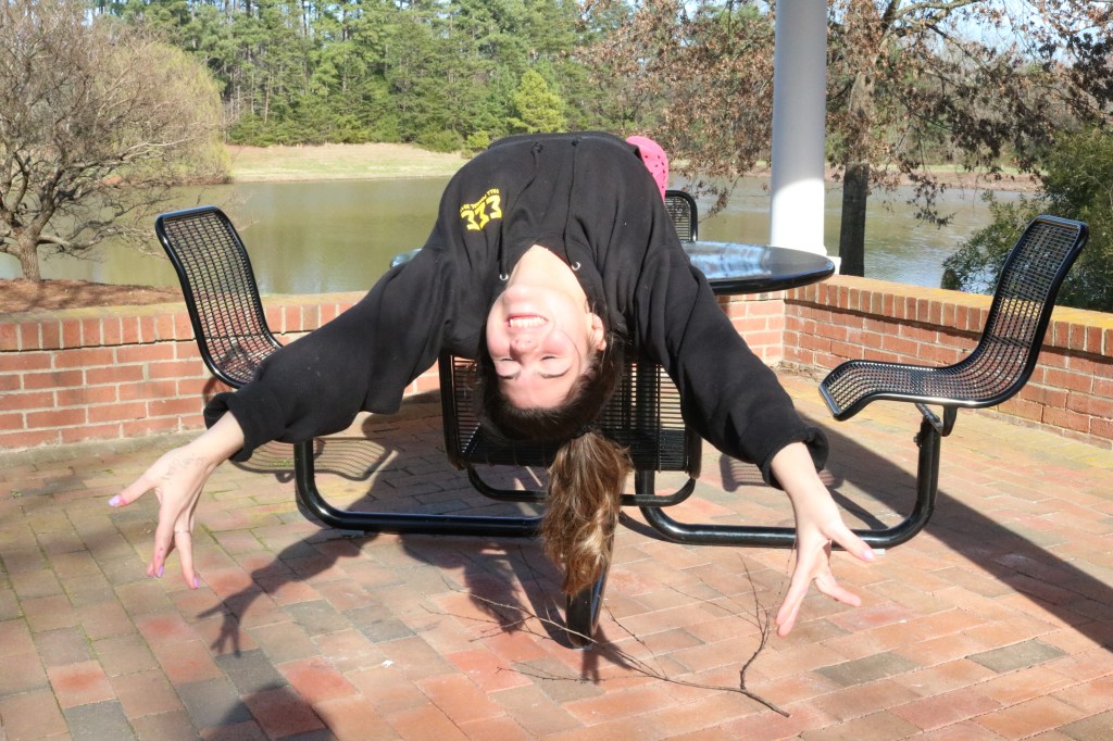
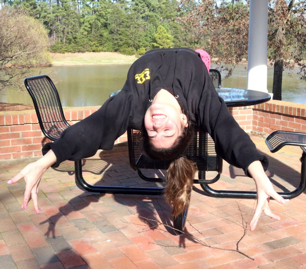
In this image, it was important for me to crop out the unnecessary objects that were in the background to make sure she was the main focus of the picture. I achieved this by eliminating everything else I felt cluttered the image and I think it looks a lot better with her being the center of the image. I also color corrected the image to make it a little brighter without washing the image out by taking the white eyedropper tool on Photoshop and clicking the bottom of the white pole so everything around it readjusted to that color scheme.
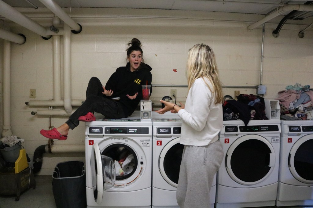
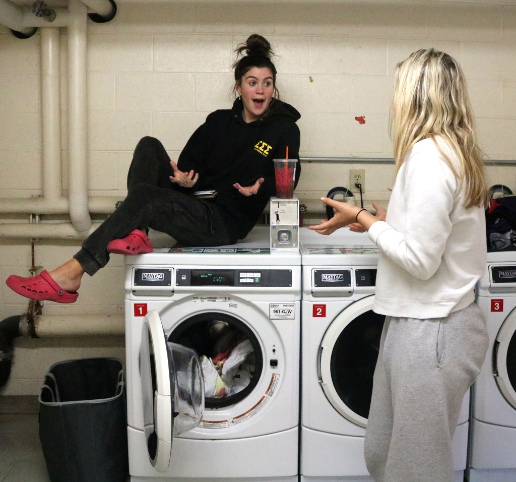
Similarly, with this image I took the same approach with the cropping technique. I felt as though all of the laundry in the background was distracting from their interaction that I wanted to be the main focus of the picture. In terms of of color correcting, I made the image slightly warmer as the lighting of the laundry room was quite harsh, which I wanted to tone down. I again, did this in photoshop by individually adjusting the Red, Blue and Green levels until I was satisfied.
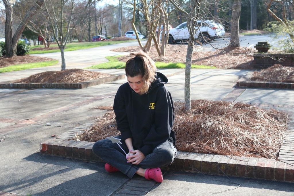
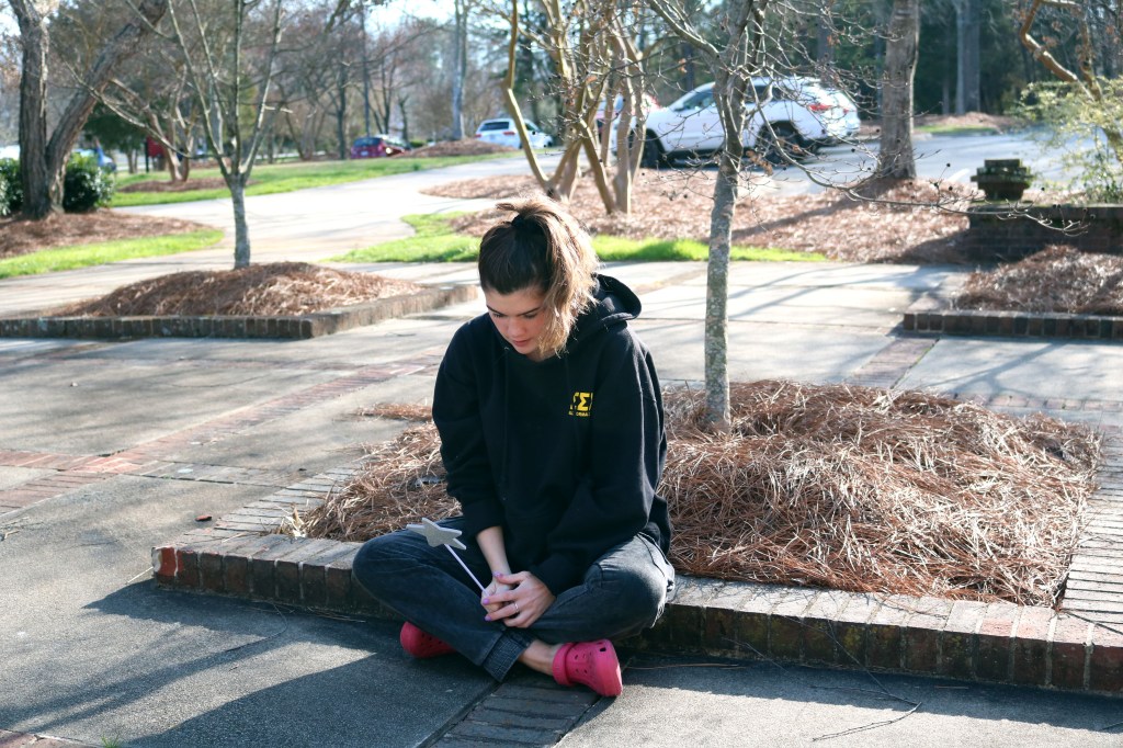
This image was adjusted just by a color correction as everything seemed a little bland, so I (surprise surprise) went in with the Levels adjuster on Photoshop and altered the Red, Green and Blue levels. This makes the colors pop more and I believes gives the photo more dimension and substance. You can tell more by looking at the color of the grass and how the green seems a lot more vibrant and bright. The added blue tones also create a different tone to the picture, which in my opinion gives it a different vibe, perhaps sadder?
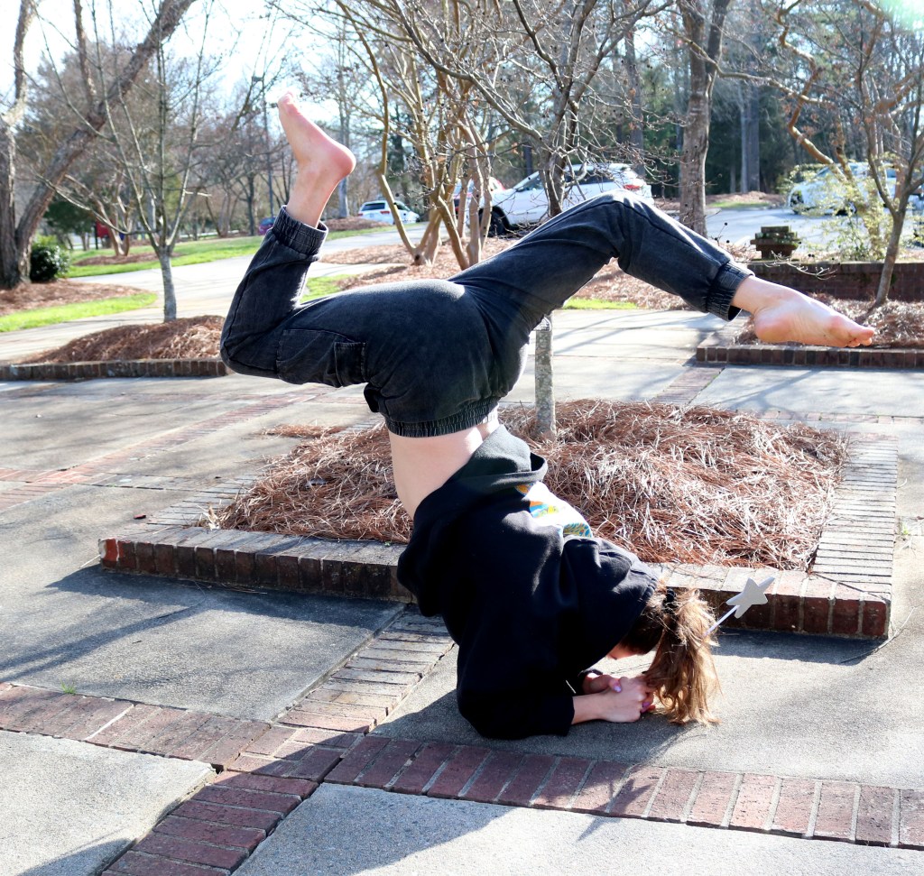
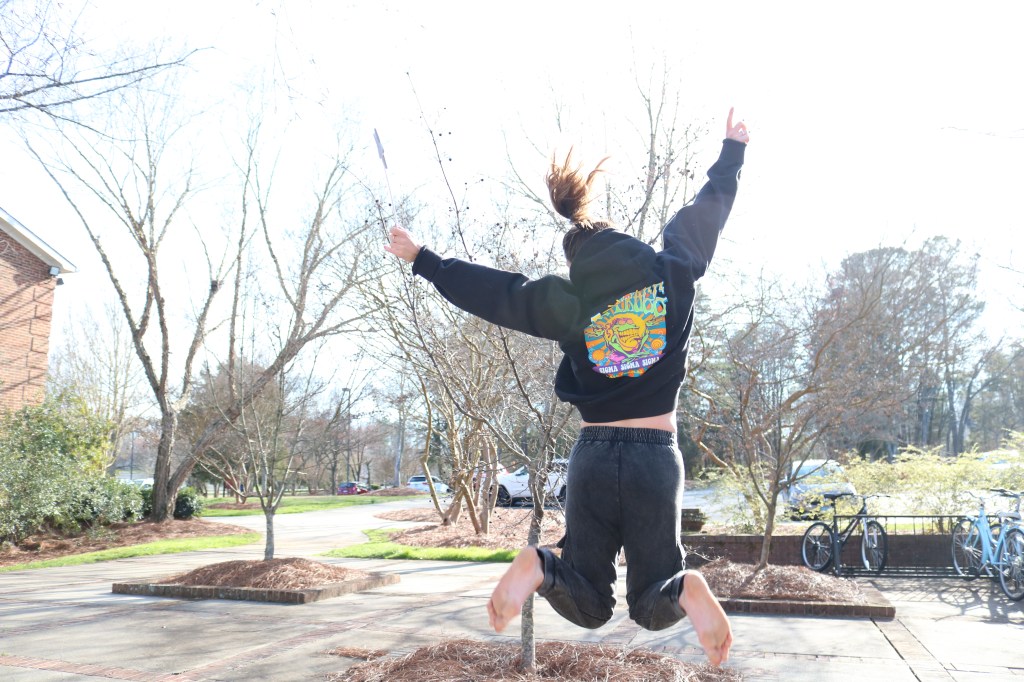
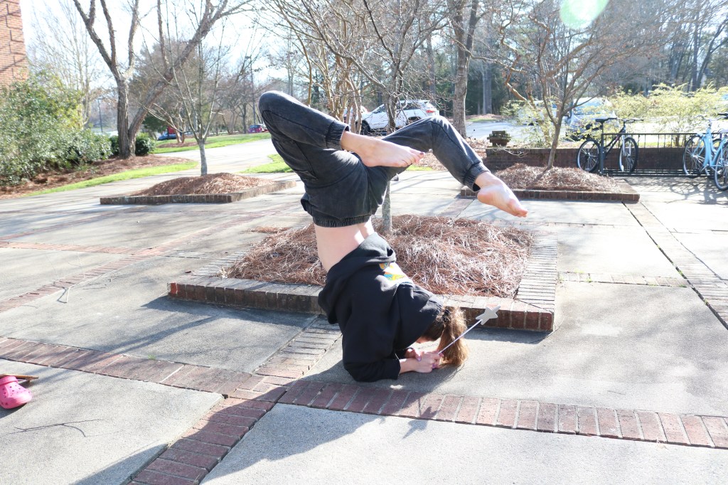
For this picture, it all seemed a little over exposed so the first thing I wanted to focus on was fixing the RGB levels to make the black in her sweatpants and sweatshirt stand out more. I also cropped the image because I felt as though small details like the wand in her hand and the detailing on the back of her sweatshirt was lost in the whole, bigger image.
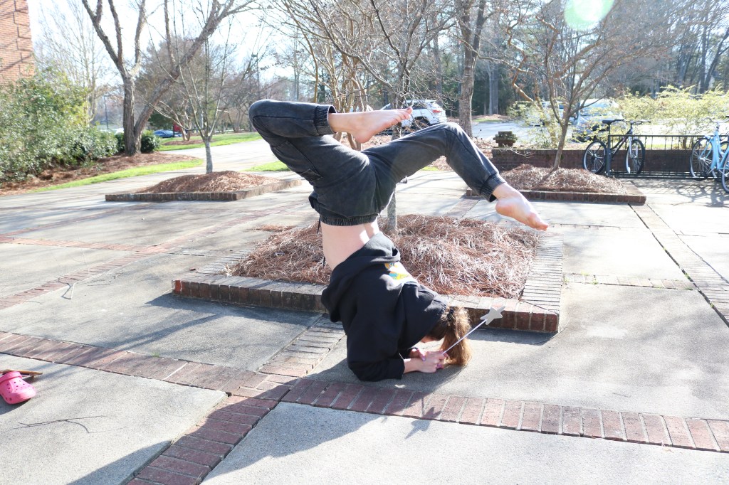
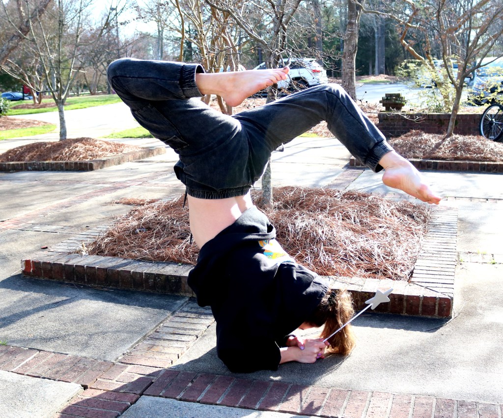
This picture is very similar to the image above so I took the same approach when editing the RGB levels and cropping.
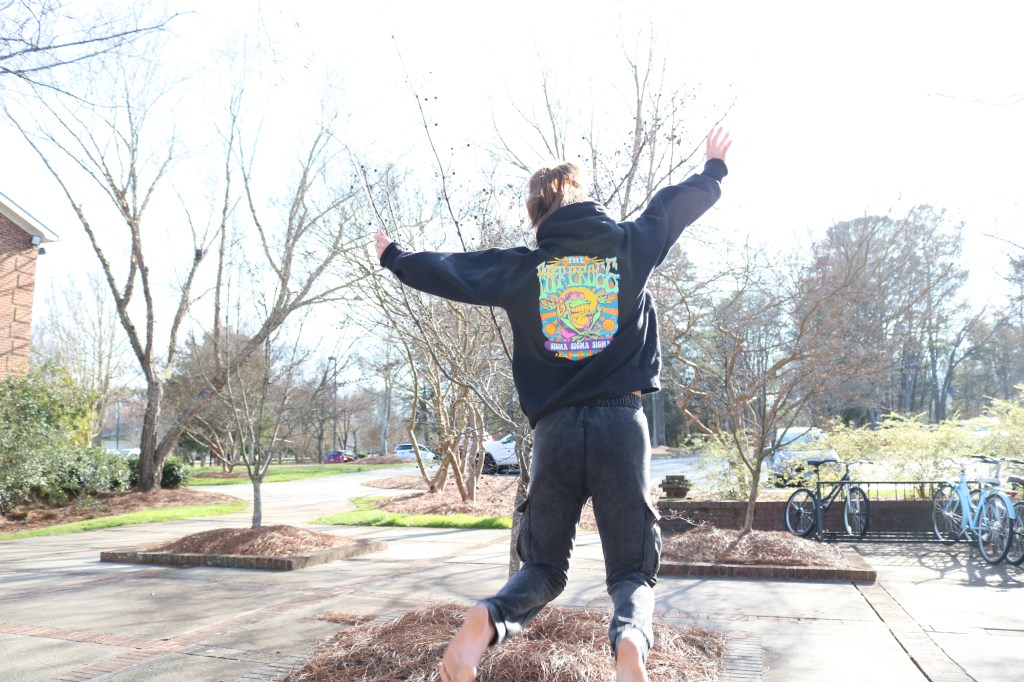
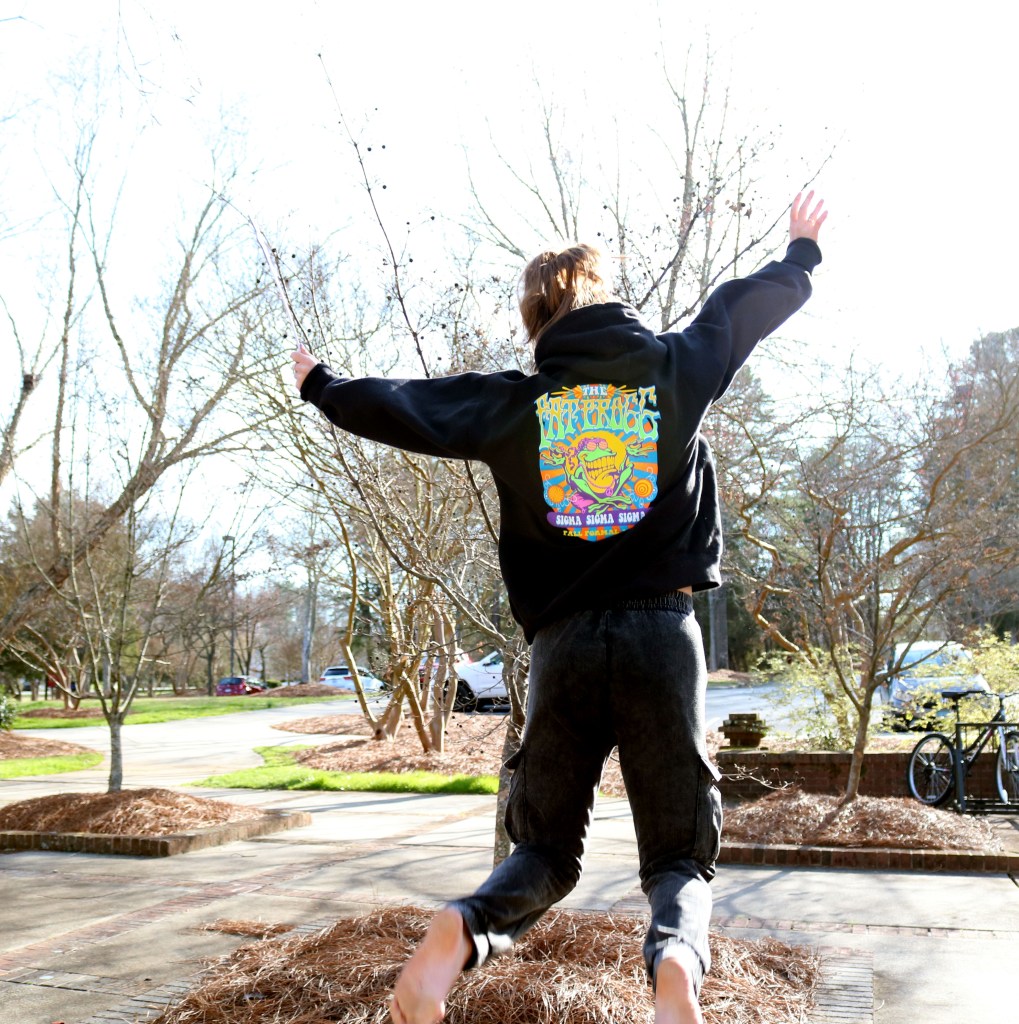
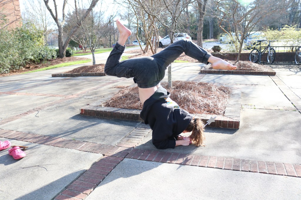
I took a slightly different approach when editing this image. Because of the amount of light in the picture, I wanted to focus in on the bright colors of her sweatshirt and the design, I took the eyedropper but used the black tool and clicked on her sweatshirt to adjust the colors that way. This adjusted all the colors well to make the image a lot less exposed and make the bright colors pop. I also cropped the photo to make her jumping the center of attention and get rid of the distracting mess in the background.
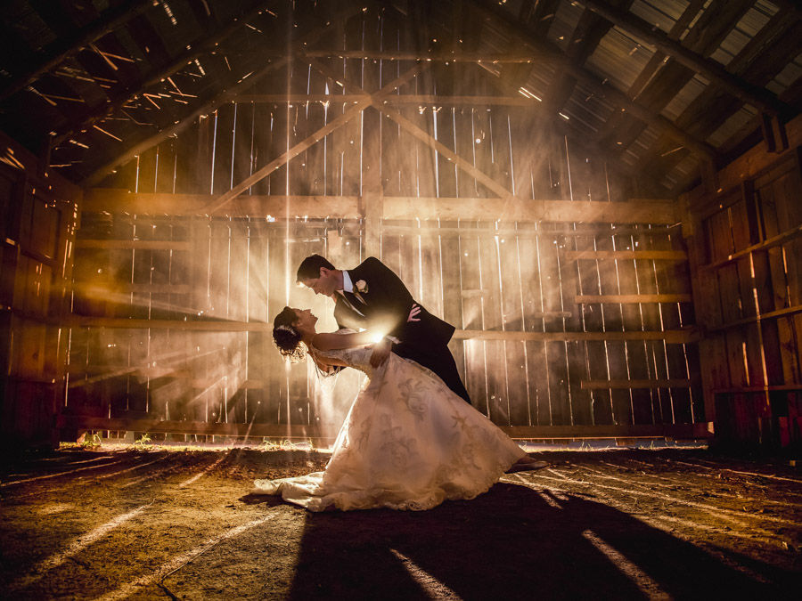
The first picture I chose was this wedding photo taken by a professional photographer at the Mitch Lenet Wedding Photography group. I like this picture for many reasons, but the first is the obvious way the photographer uses exposure of sunlight through the gaps of the wooden door to illuminate the couple. This frames the couple and really enforces the fact that they are the center of the photo. I like this picture because of the romantic and happy vibes it produces while simultaneously looking elegant and classy.

This picture struck me the first time I saw it because it truly captures the devastation that occurred on the terrorist attacks on September 11th 2001 in New York City. This picture even won the Pulitzer Prize in 2002 and was taken by Steve Ludlum. I think the impact of this photo is so great because of the framing and cropping of it, leaving just the scene of the Twin Towers in view to really emphasize the importance of this event.

My third, and final pick for a compelling picture is this photo taken in London. This is meaningful to me because I am from London and it gives me a sense of home and familiarity. The photographers decision to frame Big Ben to be the main focus of the picture is significant because of how famous Big Ben is and a lot of people associate London with this iconic setting.
Joe Rosenthal was an American photographer, born on October 9th, 1911 in Washington D.C. He won a Pulitzer Prize for his iconic photograph Raising the Flag on Iwo Jima, that was taken during the second World War (Pictured Below).
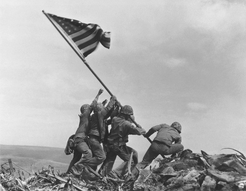
On the morning of February 23rd, 1945, Joe Rosenthal was visiting the island of Iwo Jima as he did daily on a Marine landing craft when he told that an American flag was being raised at the southern tip of the island on Mount Suribachi. After hurrying to make it on time with his Speed Graphic camera, he began to climb up to the summit of Mount Suribachi. They met up with Sargent Louis Lowrey who had already taken pictures of the flag on the summit, but they both agreed to go back together since one of them was armed.
Whole on top of the summit, Rosenthal observed a group of Marines attaching a large flag to a steel pipe while lowering another smaller flag at the same time. He thought about photographing both of these actions happening at the same time but he could not fit them both into the photo at the same time so he concentrated his efforts to the larger flag that was being raised. He set up a stand of stones and a sandbag to prop himself up, adjusted his camera accordingly and when he saw the marines preparing to raise the second, larger flag he took the picture that captured the flag being raised from the perfect angle. Making sure he had the best picture possible, he took another black and white photo showing four of the marines steadying the flagstaff waiting for the flag to be secured in place. He then gathered a group of sixteen Marines and two Navy corpsmen around the flagstaff for a posed picture.
The people of the United States viewed Rosenthal’s photo as a symbol of victory for them, with the image on every newspaper and some magazine covers. After the battle for the Island of Iwo Jima was over, this picture was used for posters in war bond drives and raised $26.3 billion while it was plastered over 30 cities for roughly two months over the summer.
This picture symbolizes the war efforts that the United States contributed to the war, and the image was turned into a statue for the ‘United States Marine Corps War Memorial’ in Arlington, Virginia and was also the photo used on a U.S postage stamp. There is also a memorial of the photo on the parade ground at ‘Marine Corps Recruit Depot Parris Island’, located in South Carolina.

Have a WordPress.com account? Log in now.

